Donation Statement Designer
Use the Statement Designer to design a custom layout for your Donation Statements. The Statement Designer allows you to make your own unique changes to the default statement templates included with the software or even create totally custom statements from scratch. This tool lets you change the intricate details of each field on your report: size, position, separators, headers and footers, etc. This is a very involved tool and usually only used by those very familiar with customization and designing that have specific requirements. The standard statement layouts included in the software are usually sufficient, so before using this tool, make sure there is not already a layout that meets your needs.
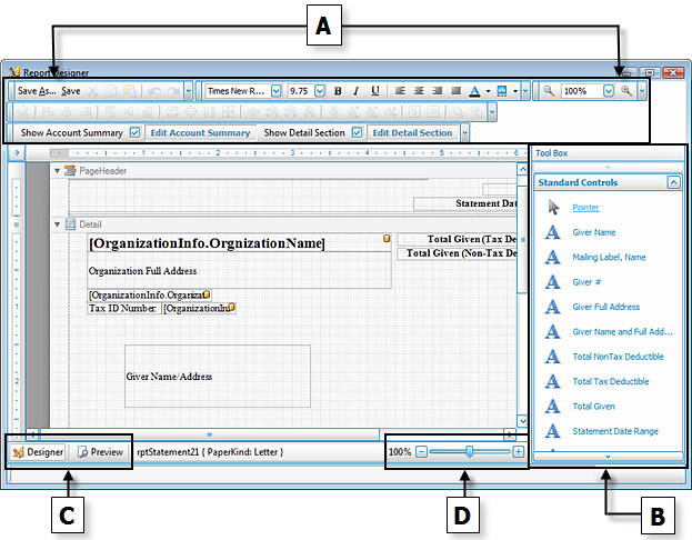
The primary objective of the Statement Designer is to take a desired item from the B — Standard Controls Tool Box and place it on the form. To do this, first click the desired item name. Then, trace the area of the form where you would like to place the selected item. The form will then show the item you selected. You can then click-and-drag it to the place you want it to be. You can also click the arrow in the upper right corner of the item to make additional selections specific to the item.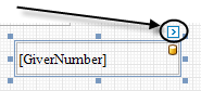
Note:
To move objects very precisely, you can hold down the CTRL key and use the arrow keys on your keyboard (←, ↑, →, or ↓) to move the object(s) very minutely. You can also hold the SHIFT key along with CTRL and the use arrow keys to either stretch or shrink the size of the object(s).
 A — Formatting and Layout Toolbars
The toolbars at the top of the screen allow you to save the layout under a specific name and adjust the font size, font style, text alignment, as well as zooming further in and further out. Below is a complete list of the items from left to right, starting with the top toolbar and ending with the bottom toolbar. Both toolbars are separated into their own groups.
Top Toolbar
|
|
Gives you the option to save the layout under a different name, especially if you have created a layout already and do not want it to be saved under the name that represents the already created layout. |
|
|
Updates the layout on which you are currently working. |
|
|
After you have selected any object or text, click this button to make a copy of the item to the clipboard while removing the item from the layout. |
|
|
After you have selected any object or text, click this button to make a copy of the item to the clipboard. When you click the button it will appear as if nothing has happened. This is because the function of copying the item to the clipboard is not visible to the eye when inside this layout. Note: |
|
|
Click this Paste button to place any item or text in the form that has been copied to the clipboard via the Cut or Copy button. |
|
|
Click this button to undo the last operation performed. |
|
|
Click this button to redo the last operation. For example, if you pressed the Undo button and changed your mind immediately afterwards, you can press the Redo button to cancel that operation. |
|
|
When you are selecting any item that has editable text for which you can choose different fonts, click the dropdown button and make a choice from this box. Fonts that you can use to change the style in which the text appears for your item selected can be chosen from this box. |
|
|
When you are selecting any item that has editable text for which you can choose a different font size, click the |
|
|
Click this button to show in bold typeface any item that presents editable text. |
|
|
Click this button to show in italicized typeface any item that presents editable text. |
|
|
Click this button to show in underlined typeface any item that presents editable text. |
|
|
Click this button to align editable text of any object to the left margin. |
|
|
Click this button to align editable text of any object to the center margin. |
|
|
Click this button to align editable text of any object to the right margin. |
|
|
Click this button to align editable text so that it reaches both left and right margins with the spacing needed on each line to do so. In other words, if you would like to have text be equally aligned towards the left as you would like to have it aligned towards the right margin, press this button. |
|
|
Click this button to set the foreground color of the selected item. |
|
|
Click this button to set the background color of the selected item. |
|
|
This feature allows you to zoom further in and further out from the normal appearance of the layout. For instance, zooming in consists of making the objects bigger so that you can get a closer look at individual objects or text on the form without making size changes to any items. In the same respect, zooming out makes the items smaller in the same respect. Either use the dropdown box to choose a percentage, or click the (—) or (+) buttons on either side to zoom further out or further in. |


 dropdown button and make a choice from this box. Font sizes that you can use to change the size in which the text appears for your item selected can be chosen from this box.


Bottom Toolbars
|
After having clicked on a control from the B — Standard Controls Tool Box and having placed the control on the form, you can use any of the following buttons to apply formatting to the control. Eight of the twenty-five controls on this list can be used with at least one control. These controls have been marked in the list below with an (*) asterisk. |
|
|
|
Align the positions of the selected controls to the grid. |
|
|
Left align the selected controls. |
|
|
Align the centers of the selected controls vertically. |
|
|
Right align the selected controls. |
|
|
Align the tops of the selected controls. |
|
|
Align the centers of the selected controls horizontally. |
|
|
Align the bottoms of the selected controls. |
|
|
Make the selected controls have the same width. |
|
|
Size the selected controls to the grid. |
|
|
Make the selected controls have the same height. |
|
|
Make the selected controls the same size. |
|
|
Make the spacing between the selected controls equal. |
|
|
Increase the spacing between the selected controls. |
|
|
Decrease the spacing between the selected controls. |
|
|
Remove the spacing between the selected controls. |
|
|
Make the spacing between the selected controls equal. |
|
|
Increase the spacing between the selected controls. |
|
|
Decrease the spacing between the selected controls. |
|
|
Remove the spacing between the selected controls. |
|
|
Horizontally center the selected controls within a band. |
|
|
Vertically center the selected controls within a band. |
|
|
Bring the selected controls to the front. |
|
|
Move the selected controls to the back. |
|
Place a  checkmark in this box to show the account summary area of the statement. checkmark in this box to show the account summary area of the statement. |
|
Click this button to change the Account Summary on the appearance and/or Columns Tab.
|
|
Place a |

|
Click this button to make changes to what shows up in the detail section of the statement using the Options tab, Columns Tab, and/or Fonts Tab.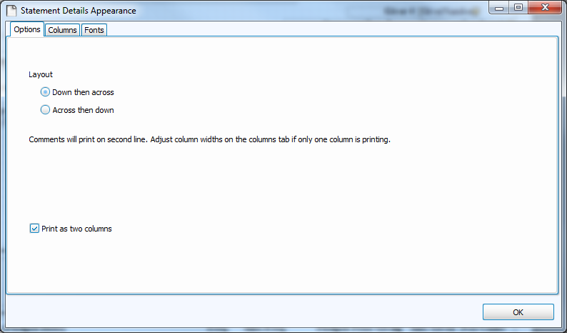 |

|
Place a checkmark in this box to show the quarterly section of the statement.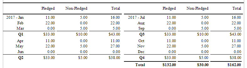 |

|
Click this button to make changes to what shows up in the quarterly section of the statement using the Options tab, Columns Tab, and Fonts Tab. You will also want to verify that the Quarterly Section date rangeIf you are using a statement layout which will include the Quarterly section, verify that the date rage of the desired Quarter is showing in this box. If you are unsure if your statement layout includes this section, check the
Donation Statement Designer.
is correct.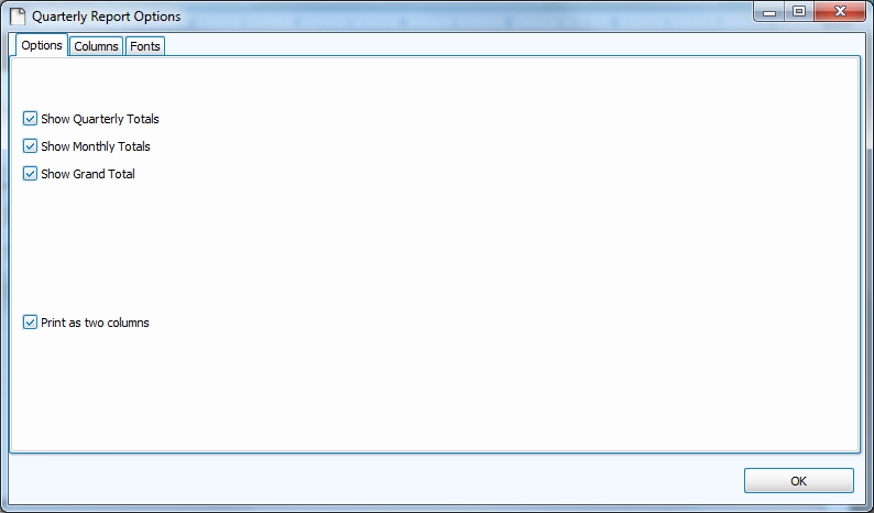 |
 To Grid (*)
 Lefts
Lefts Centers
 Rights
 Tops
Tops Middles
 Bottoms
 Width
Width Size to Grid (*)
 Height
 Both
Both Make Equal
 Increase
 Decrease
 Remove
 Make Equal
 Increase
 Decrease
 Remove
 Horizontally (*)
 Vertically (*)
 Bring To Front (*)
 Send To Back (*)
B — Standard Controls Tool Box
|
Note:
The following is a list of all of the fields you can add to your form: |
|

|
Clicking this lets you move the existing items on the form. Unless you manually select another Standard Controls item, this item will be already selected for you to move things around.
|

|
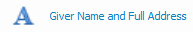
The Giver Name as shown in the Givers section of the Donations Module. |

|
The Mailing Label of the Giver followed by a comma and the Name, as shown in the Givers section of the Donations Module. |

|
The Giver Number as shown in the Givers section of the Donations Module. |

|
A combination of the address location, including the city, state (or province), and zip code (postal code), as shown in the Givers section of the Donations Module. |
|
A combination of the Giver Name, and the address location, including the city, state (or province), and zip code (postal code), as shown in the Givers section of the Donations Module. |

|
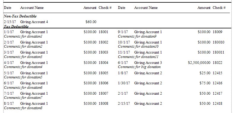
The calculated total amount set to appear on the statement as non-tax deductible. |

|
The calculated total amount set to appear on the statement as tax deductible. |

|
The total amount of money given. |

|
The date range selected prior to entering the Statement Designer screen, and essentially, the date range of the statements being run. |

|
The date on which the statement is printed. |

|
The Tax Agency Statement required on all official statements by your national government (only applies to U.S.A. and Canada). |

|
Shows the text you place in the Global Statement Memo field of the Donation Statement screen. |

|
Shows the text you place in the Personalized Statement Memo field of the Donation Statement screen. |

|
The Organization Name stored in the Org. Info currently selected on the Donation Statement screen. |

|
The Organization Name stored in the Org. Info currently selected on the Donation Statement screen, combined with Address 1, and Address 2 fields. |

|
The Address fields, City, State, and Zip Code of the Organization Name stored in the Org. Info selected on the Donation Statement screen. |

|
The Address 1 field of the Organization Name stored in the Org. Info selected on the Donation Statement screen. |

|
The Address 2 field of the Organization Name stored in the Org. Info selected on the Donation Statement screen. |

|
The City field of the Organization Name stored in the Org. Info selected on the Donation Statement screen. |

|
The State field of the Organization Name stored in the Org. Info selected on the Donation Statement screen. |

|
The Zip field of the Organization Name stored in the Org. Info selected on the Donation Statement screen. |

|
The TaxID field of the Organization Name stored in the Org. Info selected on the Donation Statement screen. |

|
The Phone 1 field of the Organization Name stored in the Org. Info selected on the Donation Statement screen. |

|
The Phone 2 field of the Organization Name stored in the Org. Info selected on the Donation Statement screen. |

|
The Fax field of the Organization Name stored in the Org. Info selected on the Donation Statement screen. |

|
The Email field of the Organization Name stored in the Org. Info selected on the Donation Statement screen. |

|
The Web Address field of the Organization Name stored in the Org. Info selected on the Donation Statement screen. |

|
Canada Users Only: The Next Receipt # set to print on the statement, according to the Donation Receipt Info. stored on the Options tab of the Donations Statement screen. |

|
Canada Users Only: The Canadian Tax Agency name stored on the Options tab of the Donation Statement Screen. |

|
Canada Users Only: The Canada Tax Website stored on the Options tab of the Donation Statement Screen. |
|
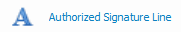
Canada Users Only:The signature line required for the official donation receipt to be validated when signed. |

|
Use this to select a picture file stored on your computer to show up in the place where you set this item on the form. |

|
Use this to type in text that you want your statements to show, and place it in the desired location on the form. |

|
A straight line moving from left to right. |

|
A straight line moving from up to down. |

|
A box that you can expand as wide as necessary to group together form items. |

|
An item that once placed on the form you can select a shape for it to show. |
 pointer object in the Standard Controls will appear as
  underlined. This is an example of what indicates the object as active and ready for you to use. And when you click a different item, that new item will then contain the line underneath it.
C — Designer / Preview
- Click the Designer button
 to make any adjustments to the fields on the layout (as explained above).
 - Click the Preview button
 to view how the layout items would look if printed out.
Note:
The Preview will display the layout using demo data, not your Church's data.
D — Zoom
Use this to zoom in and out, making the view of the statement layout and its objects bigger or smaller.
Once you have your layout completely setup, go up to the top left and click the Save As button to give it a Statement Layout name, so that you can select it the next time you wish to print your statements with a specific layout. Enter a name or edit the current name and click OK.
Note:
When naming a new report layout, keep in mind that you are creating a template which can be used for other reports with different data in the future, therefore names should NOT include specific dates or the search criteria you used to compile the report. Instead, the name should indicate what kind of information will be included in the report.
Exit out of Report Designer. The saved layout will now be listed in the drop box for use in the future and you will be returned to the Step 2 screen of Donation Statements where you can click Print to view a Print Preview and send the statements to your printer.
